
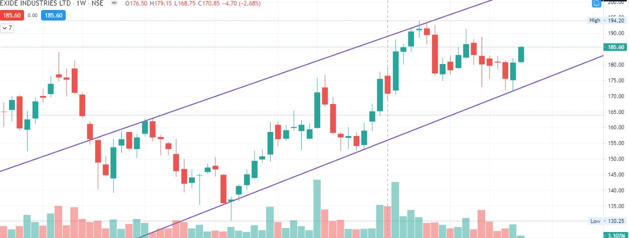
In financial charts, a candle, also known as a candlestick, is a visual representation of the price movement of an asset, such as a stock, currency, or commodity, over a certain time period. Each candle represents a specific time frame, such as a day, a week, or an hour. A candlestick is made up of a rectangular body and two thin lines, called shadows or wicks, that extend from the top and bottom of the body. The body represents the opening and closing prices of the asset during the time period, while the shadows show the highest and lowest prices reached. If the candle is green or white, it means that the price of the asset went up during the time period, and the opening price is represented by the bottom of the body, while the closing price is represented by the top of the body. Conversely, if the candle is red or black, it means that the price of the asset went down during the time period, and the opening price is represented by the top of the body, while the closing price is represented by the bottom of the body. Candlestick charts are widely used by traders and […]